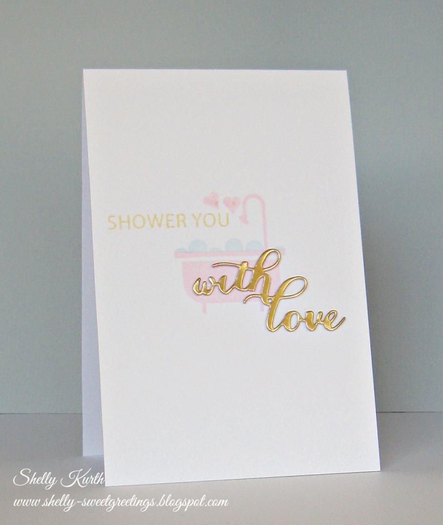
I'm swinging on in today to share a card I made and a conclusion.
*Feel free to scroll down, if you don't want to read my conclusion.*
Okay. So, this is the conclusion I have come to. Remember when I asked for help and your thoughts about my last photo?...I received a number of personal opinions and I absolutely, enjoyed hearing them! One thing I did notice, is everyone truly sees things differently. Some agreed with others on certain things, some didn't. Some thought my photo was great, others thought okay, etc. All in all, different. Each and every thought, different.
So, I personally have come to this. Not only does everyone see things differently. But I also truly believe it has to do with computers, as well. There are wide range of computers/laptops and some may look similar or even be the exact same thing. But photos (and things) will still be shown different on each and every single one. Why, I think this?...Have you seen all the settings there are?...You can change the brightness, that there will certainly change how something looks to someone. Not all have their brightness the same. How about the contrast?...How about if your computer if full or partial HD or perhaps, not at all?...How about the screen resolution?...Seriously, with so many little factors and settings, nothing could possibly be the same. So, while this is all just my thoughts, I'm going to continue taking the best of photos that I can. And I took in all your tips as well. I figure my photos can only get better, not worse...Let's not go back to when I first started! LOL ;) Again, I truly enjoyed everyone's thoughts and thank you so much. :) Please though, if my photo is THAT bad, let me know! LOL I will certainly take more tips along the way! ;)
Now, onto my card.
I saw Virginia's View Challenge and knew I wanted to play! Which, I surprised myself some because for days I had no crafty mojo! Or maybe I did, but have been overwhelmed by all these new releases, etc. (Have you seen all the new goodies out there?!) ;)
Okay. Here's my card.
Thanks so much for stopping by!
Enjoy your day!


Shelly your post is thoughtful, useful and funny at the same time. I love your card for Virginia's view. I am a perfectionist and I see perfection!
ReplyDeletePerfect placement on your card! Fun sentiment too -- congrats on your new gig also~
ReplyDeleteGreat card! I'm a perfectionist, and I have discovered that most other people don't see the imperfections in my cards. I have also discovered that if you tilt your card just the right angle, the uneven stamping "disappears" in the photo, lol! I just give those cards to people who I know don't care about straight lines and even-ness. ;-)
ReplyDeleteThis is simply gorgeous, Shelly! The soft colors and gold are such a stunning combo, and you used them beautifully! So glad that you join the fun over Virginia’s View “Clean Slate” Challenge! PS: About the photos, I am also trying to improve as I go. I'd say, try different options and see what make YOU happy--that's the key ;)
ReplyDeleteSUCH a fun card! Love it.
ReplyDeleteYes, it's so funny, I'll post something that has been stamped in pink and people will say it is red....
Thanks for sharing your thoughts! I appreciate you taking the time for typing it all up! I know that my "photo skills" have improved quite a bit over the years and when I look back, I think...what was I thinking?!! LOL!!
ReplyDeleteYour card is so soft and pretty here! I love the touch of gold lettering!! :) HUGS
Haha! I'm the same way, if its crooked or i got a smudge or a even a speck, i have to fix it or cover it up!! But anyway! Lovely card!! The gold words are awesome against the pink tub!! So cute!!
ReplyDeleteSuch a sweet card!
ReplyDeleteP/s: It's hard to get colours right in a photo...just post what looks good to you! I think everything you do is awesome anyway. You do CAS oh so well!
Another absolutely super "sweet greetings" card. Photography is rocket science to me. I'm clueless. I just know Blogger generally makes my photos look crappier than they looked in Photoscape (which I use to edit). And even in Flickr the same photos look better than on my blog :(
ReplyDeleteyou have done it again.. this is so sweet.. i totally love it
ReplyDeleteI love the word dies, and love how soft the stamping is. Great card!
ReplyDeleteI love that DIES sentiment too and I see how soft you stamped the main Image...another lovely CAS card you made Shelly...
ReplyDelete