Just look at that inspiration photo...
Let me be honest. Those colors did get the best of me...at first. ;) After some playing around and hard thinking though, this is what I came up with.
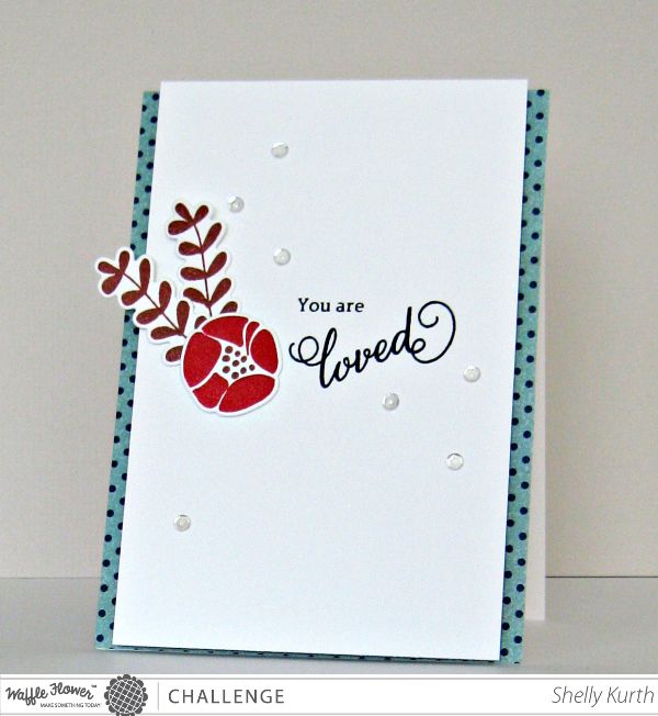
Oooh, so what do you think?!...I choose to keep my card very clean and just add some 'pops' of the different colors. I tried so many things with those colors, but liked this outcome the best. ;) With my die cut pieces, the 'branches/leaves' I rolled the edges some to make them stand out from the base. Then added my flower slightly over them. To finish my card off, I used some clear sequins and added foam squares on the back of my 'panel' before adhering to my base card.
Be sure to swing on over to the Waffle Flower Challenge and see all the amazing DT creations!!! And while you're there, I hope you'll join us! :)
Thanks for stopping by!
Enjoy your day!
Waffle Flower Supplies:
Loved Stamp Set
Loved Die Set


super love this Shelly!
ReplyDeleteSo pretty Shelly!! Love the colors and sequins! ;)
ReplyDeleteFantastic card Shelly--love those colours!
ReplyDeleteGreat colour combo - works brilliantly for your gorgeous design, Jo x
ReplyDeleteBeautiful ! Love the simplicity :)
ReplyDeleteI love that you left your card clean with pops of color! It is so eye catching and elegant- hard to believe you had trouble with the colors :) It's beautiful!
ReplyDeleteFabulous card!! Love the design with the flower images and pattern papers on each side!!
ReplyDeletewhat a pretty card.. love it
ReplyDeleteThis is so pretty! Great use of those colors!
ReplyDeleteA+ on your first assignment ;)
ReplyDeleteWhat a pretty card!
ReplyDeleteThis is so pretty! Great job using the colors!
ReplyDeleteloved that sentiment with its font and curls. I love just that hint of pattern paper on the sides Shelly.
ReplyDeleteoh so sweet! love you simple designs, Shelly!
ReplyDeleteGorgeous!!
ReplyDeleteLove this Shelly!!
ReplyDeleteLove how restrained you are with the colors. It actually really highlights them I think!
ReplyDeleteOh, well done, Shelly! This is such a pretty card for your first Waffle DT post! You kept it CAS, but with tons of interest and I'm so loving the peek of polka dot from both sides!! Am I wrong or did you give your blog a new look? I love the white space, of course from side to side and your banner font is MWAH! Hugs, Darnell
ReplyDeleteThis is sooooo sweet! I love the addition of those clear sequins!
ReplyDeleteLove it! The leaves hanging off the edge of the card are perfect and I love the peek of patterned paper on the edges!
ReplyDeleteShelly the color combo is fit together with the flower main image..love the sequin too..
ReplyDeleteAdorable CAS card again Shelly