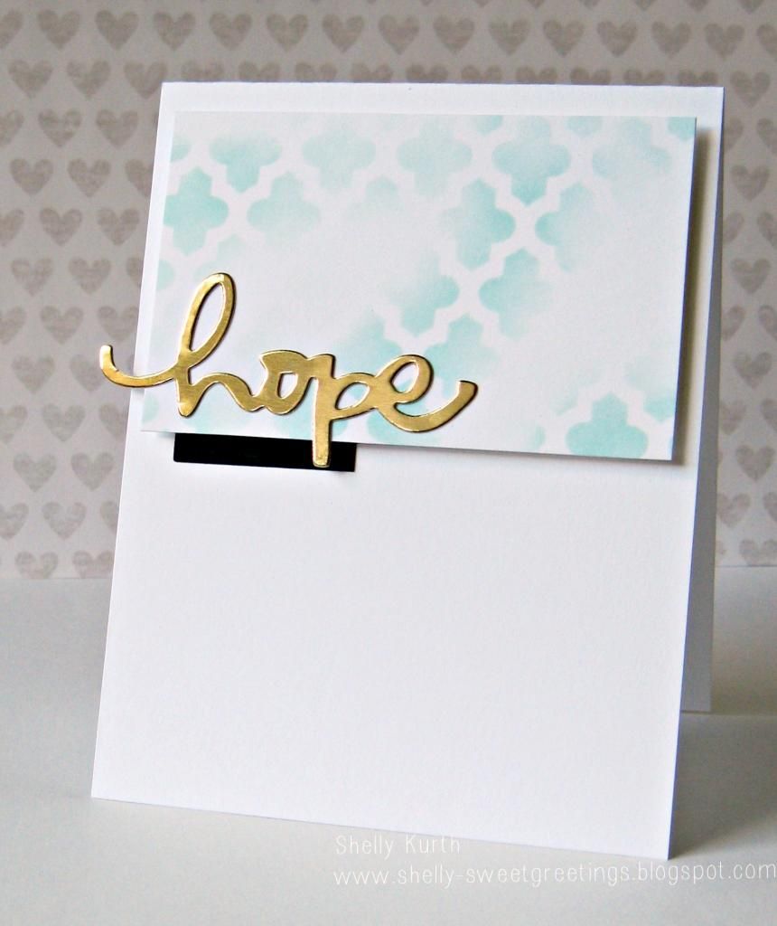
Hey, y'all! Happy Friday!!! :) Hope all finds you well?!...I'm just swinging on in, to share a card a made for the current Less is More challenge. I was running a little close to the deadline, but happened to make it! ;)
So, here's my take!
Keeping things simple. For my background, I did a little stenciling. Once done, I was thinking to add some type of stamp over it. But couldn't figure it out, so I left it the way it was. Then for the tab underneath, I thought black would give it a nice 'pop'. But I still had no real idea what to do about a sentiment. Then as I went through my dies, saw some words and decided on 'hope'. And what better to have it in gold, yeah?!...
Thank you for stopping by!
Enjoy your day!


It looks fab Shelly well done :) Viv xx
ReplyDeleteSo glad you made the deadline Shelly, super take on the sketch
ReplyDeleteThanks for joining in with Less is More this week
Anne
LIM Designer
Simply gorgeous. Utterly CAS and perfect use of the sketch
ReplyDeleteThanks so much for sharing and taking part.
Sarah xx
Less is More
LOVE!
ReplyDeletelove that pop of black under the gold sentiment. great card!
ReplyDeletegorgeous card.. I love how you used that stencil.. so pretty
ReplyDeleteoh Shelly, I seriously LOVE this card!! The strip of black underneath adds so much to it!!! Plus the subtle blue with the gold on top ... yummm!
ReplyDeleteI love the faded inked panel u did :) amazing design!
ReplyDeleteThis looks great Shelly, the touch of black was a great addition!
ReplyDeleteThanks so much
Chrissie
"Less is More"
Love it! The color combination you used is just striking!
ReplyDelete